In 2023 I completed a Professional Diploma in UX Design with the UX Design Institute. This project showcases my coursework, carried out over the duration of the course. It covers key aspects of the UX design process, from research through to the design of a prototype for a hotel booking website.
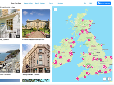
Homepage of the final rendered prototype in Figma. Read the journey for how I got here.
The brief
Create an online booking experience for a new hotel that is simple, accessible and based on an understanding of its target users. Specifically, design a new desktop website for the client with a focus on the hotel booking process: how users search for and book hotel rooms online.
The end goal is to design and build a clickable prototype that can be tested with users, along with a detailed set of wireframes.
Summary of contents
The project is divided into four main phases, each which builds on the output of the previous. I conclude with a retrospective.
Research
-
Excerpt from competitive benchmarking presentation
-
Summary of insights from competitive benchmarking
-
Usabilty test I conducted with a volunteer
-
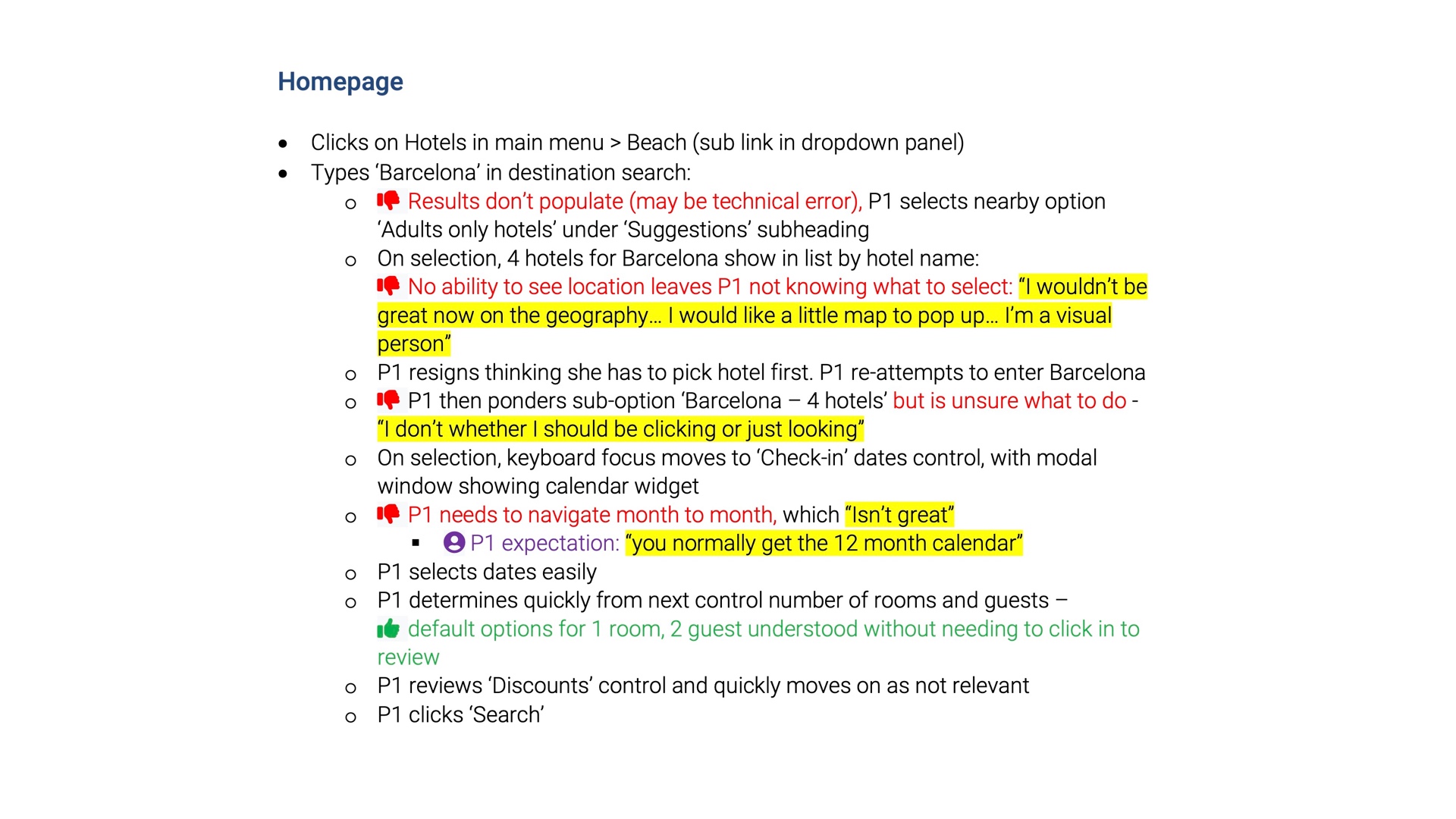
Excerpt of note taking from other recorded user tests
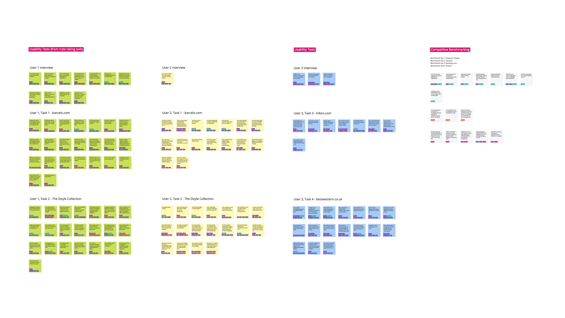
I undertook three research tasks in preparation:
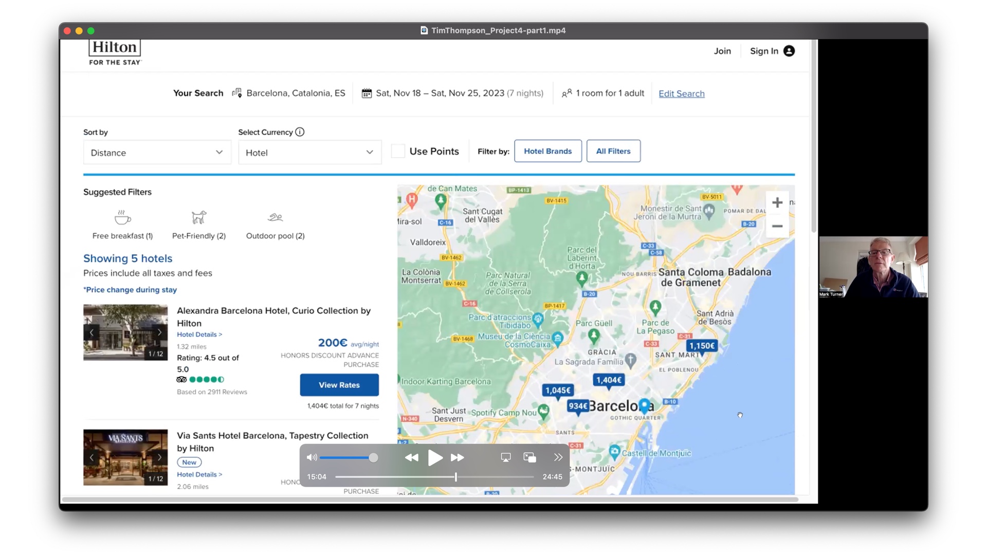
Competitive benchmarking
I reviewed three main competitors: Radisson, Novotel and Booking.com (slide 1 taken from Radisson). For deeper insights, I included a fourth from a slightly different sector: Airbnb. A summary of my findings are shown in slide 2.
This is a great brainstorming tool, and can help identify good convention and opportunities for improvement, but I am mainly interested in how actual users respond.
User testing
Using a script, I interviewed and recorded a user test with a volunteer (slide 3). I walked the participant through a structured set of tasks on different websites, trying to avoid leading questions, and helping them talk aloud their thinking, particularly at times when they got stuck or lost.
I was keen to gain insight into their goals, behaviours and context, the pain points they encountered, what they were hoping to find but didn't, and what went well.
Note taking
Complementary to user testing, I carried out note taking from other recorded user test sesssions (slide 4). I codified the notes to draw out the insights described above, with text colouring for key responses, and marker pen highlighting for notable quotes.
Analysis
To make some sense of the research data, I carried out two main activities:
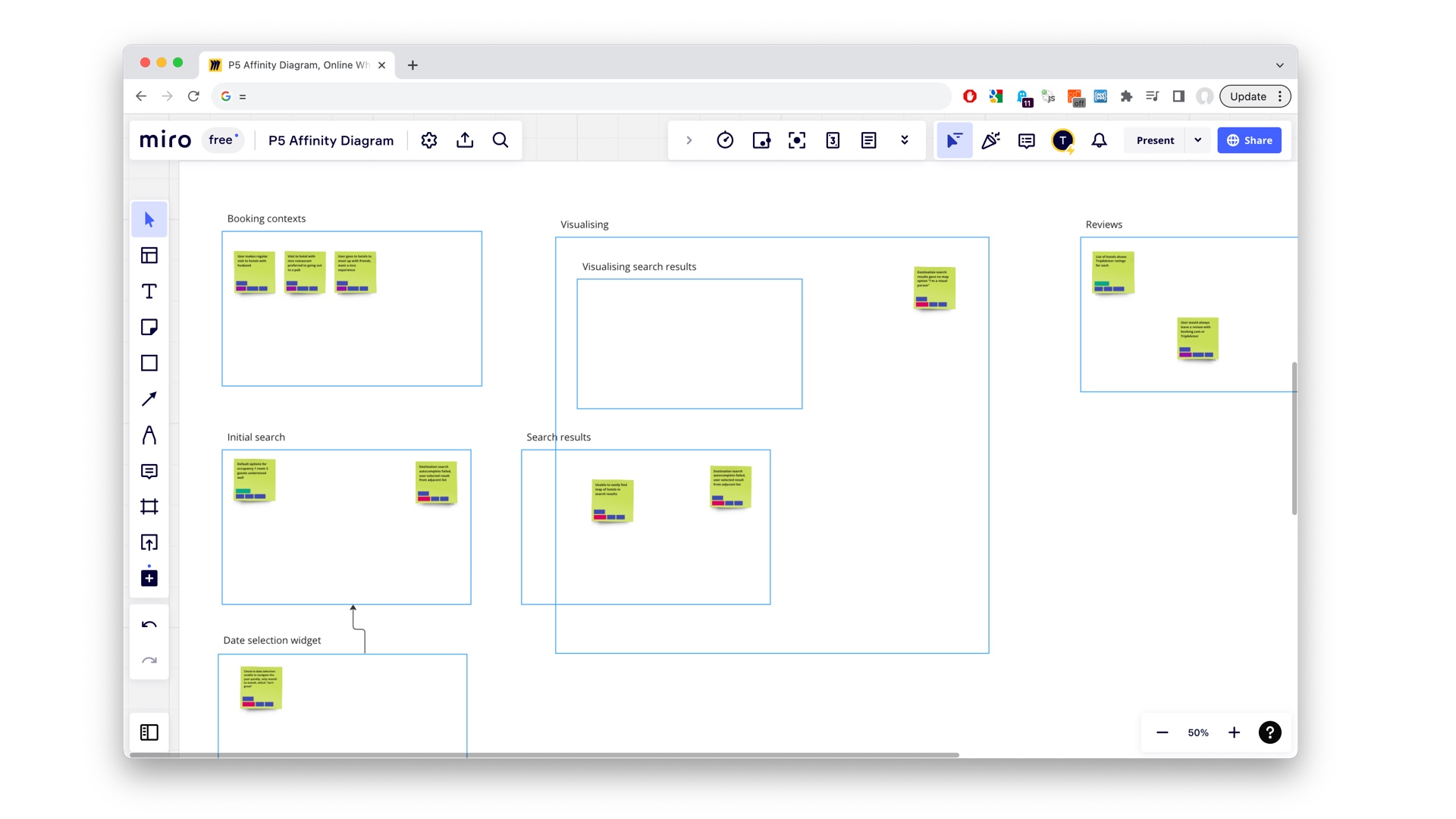
Affinity diagram with Miro
An affinity diagram is a means to take all the research data from different sources, in this case unstructured data, and find common themes.
Diagram highlights
I outline below some of the highights from the process. Note that the images are low resolution, but the full resolution Miro project is linked to beneath.
-
Initial sorting
I spread out the data points identified on to the canvas, intially organised and colour coded by each research activity.
-
Sorting in progress
Thematic grouping was a fluid process, with ideas evolving and groupings and group names changing as post-its were arranged onto the canvas.
-
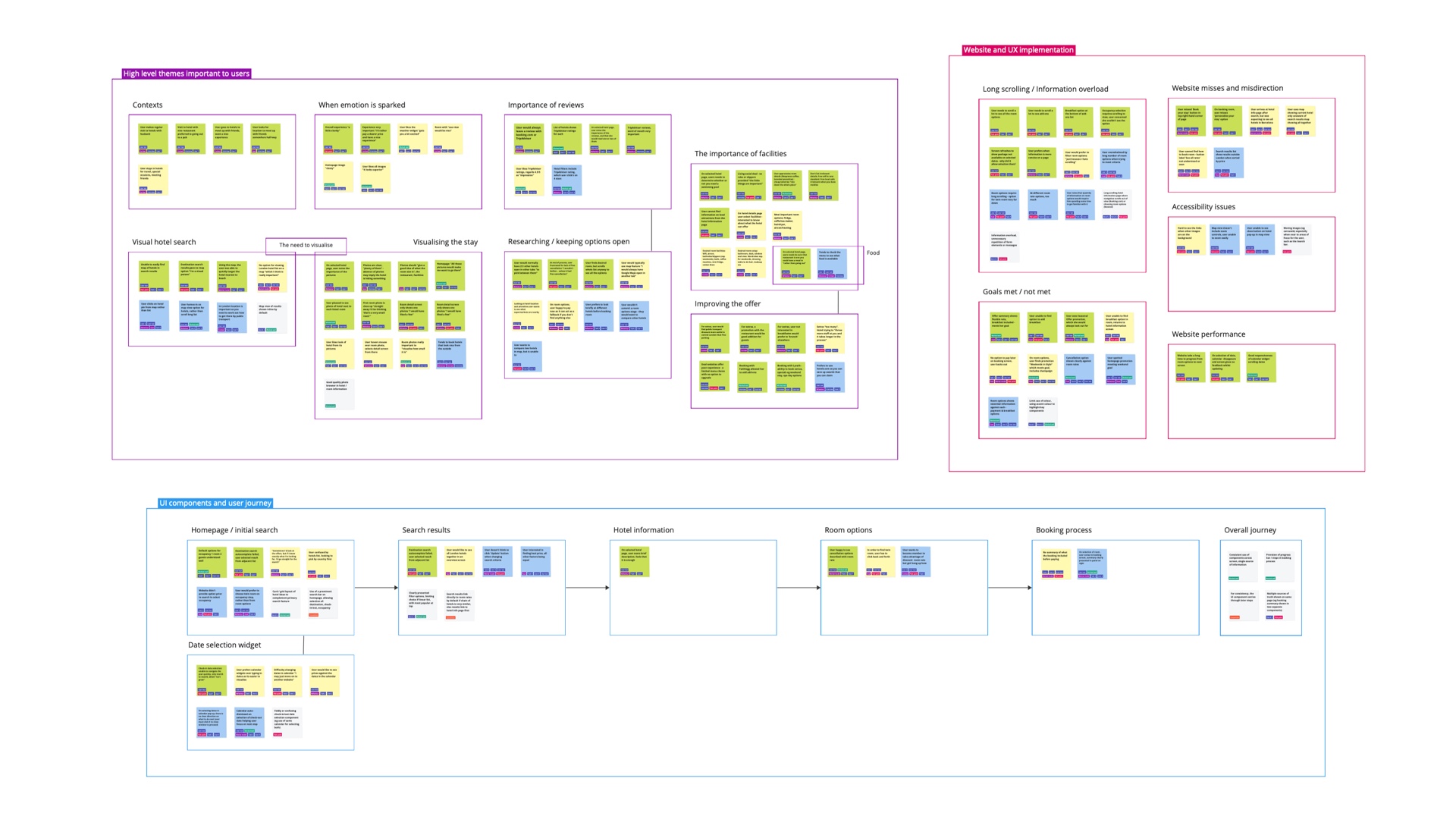
Affinity diagram on completion, with thematic groupings having taken shape
The finished sort
This is the final result. I made use of colour coding, so where a variety of colours coalesce under a given theme, it lends it more weight, as it is being referenced from multiple sources.
I also used tagging to categorise notes by perspective, such as goal, behaviour, context or pain point. When reviewing the theme, it helps identify the type of intervention required.
Key insights
Some of the salient themes I drew out from the diagram included:
- the importance for users to visualise the hotel search (ie with a map)
- visualising the stay, with good quality photos of the hotel and rooms to "give a good idea of what the room size is"
- a common behaviour was the desire to see independent reviews
- good information on hotel facilities and dining options
- a particularly strong shared pain point was long scrolling and information overload when viewing room options
Customer journey map
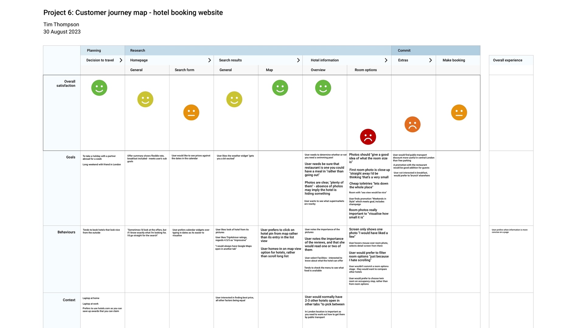
Screenshot of the top area of the customer journey map, showing the overall user satisfaction.
Taking the data from the affinity diagram, the customer journey map plots that data along the linear stages of the booking process.
The overall mood of users is guaged at each stage and represented by a smiley face to identify which areas of the flow may need greater attention.
The data is further categorised by row according to goals, behaviours, context, pain points, and what worked well. The stronger user reactions, or more important points, are noted in larger text.
A quick assessment of the journey map suggests the greatest improvements could be made at the later stages of the process, in particular around the viewing and selection of room options.
Concept
This is the ideation phase, where I take findings from the analysis and begin to work them into a design concept. Note that this also includes taking insights from broader design principles, which guides some of the ideas behind my solution.
I carried out two main activites:
Flow diagram
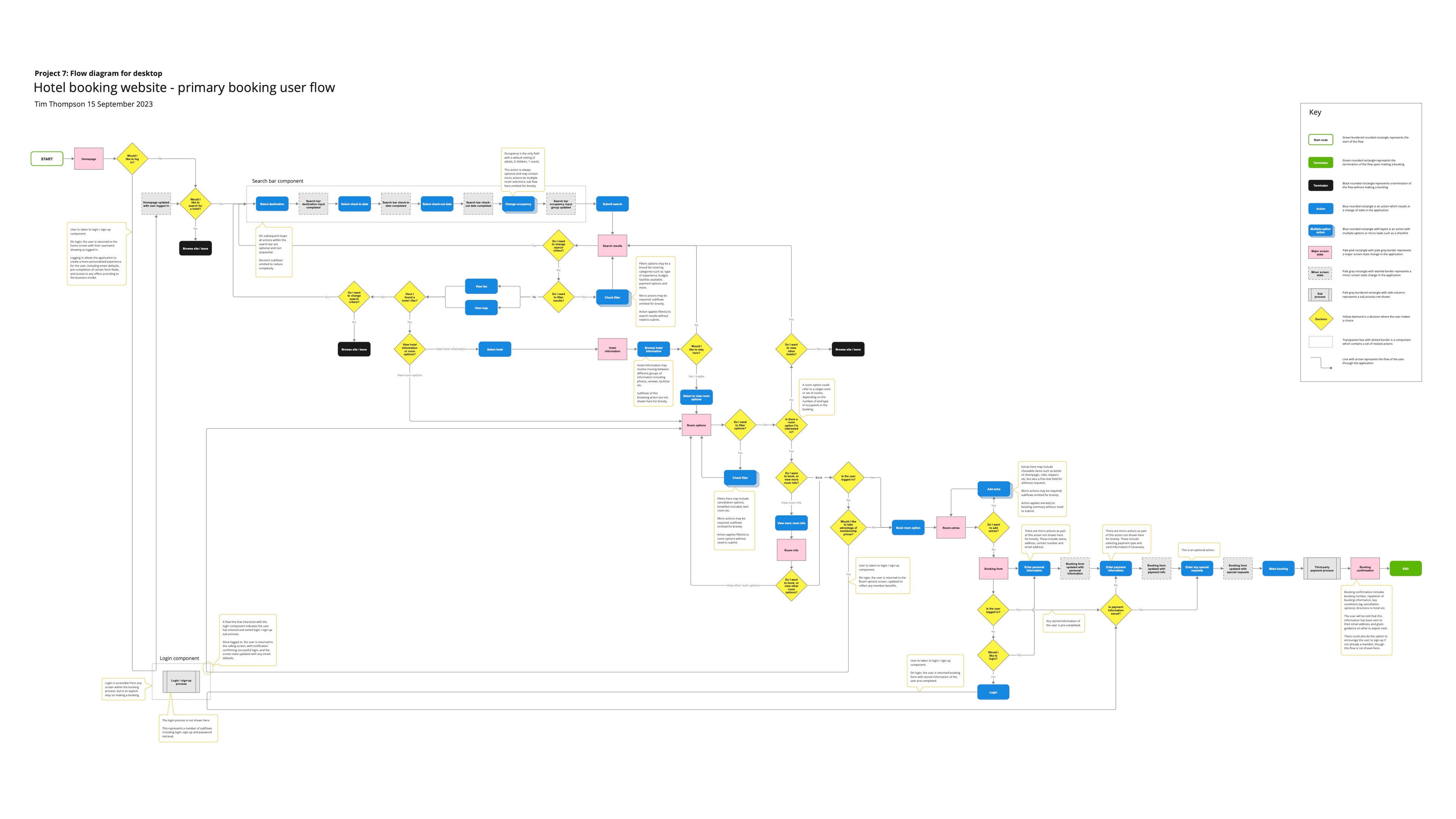
Low resolution view of the flow diagram, showing its full extent.
Using Miro, I mapped out how the user would flow through the booking process, showing decisions and screen states, from the Homepage to Booking confirmation.
Major screen states are represented by the pink boxes.
Key problems to solve here included where and how users would filter results, both in the initial hotel search and for viewing room options, to keep results relevant and reduce the burden of long scrolling and information overload.
I added subflows for login and access to membership rates. Whilst out of scope, I wanted to keep these factors in mind, as they are common conventions elsewhere, and can affect almost exponentially the number of options shown to the user, something that I wanted my solution to address.
Interaction design
With pencil and paper, I began sketching out how the user might interact with each screen of the flow.
Sketch highlights
I showcase below a few of the sketches and the ideas behind them.
-
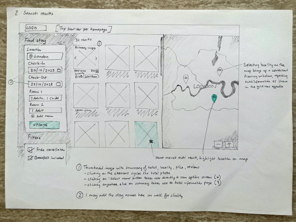
Homepage and hotel search
This shows a layout of the homepage with the main UI components - Search panel, results grid and map view - arranged horizontally.
Whilst the search panel location breaks with predominant convention of a horizontally-oriented search bar along the top, it allows me to keep all parameters, including any filters added, in the same place, as a single source of truth across multiple screens.
When I think of the importance for users to be able to visualise their search on a map, the orientation of the search panel as a vertical bar on the left is not so unusual if you compare it to Google Maps, which at the time of writing takes a similar approach for its desktop layout.
-
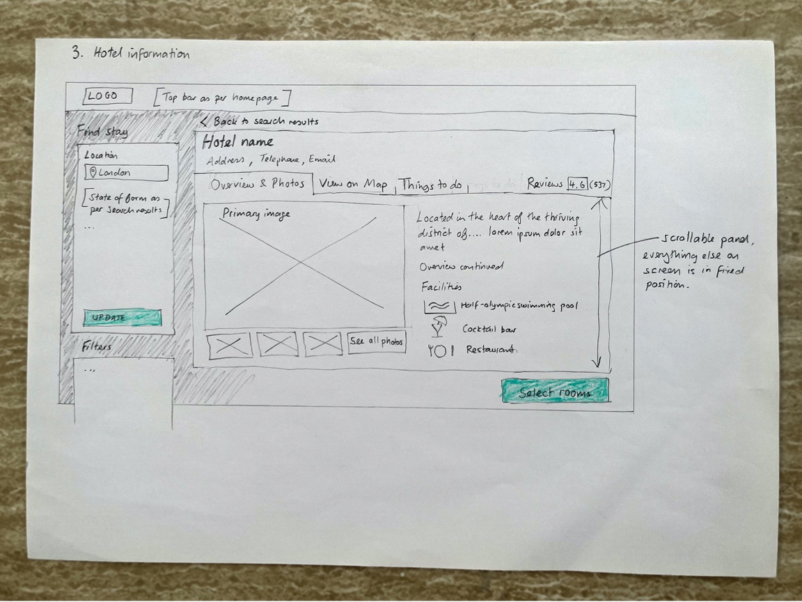
Hotel overview
One of my main aims here was to rationalise typically lengthy information about a hotel and reduce the need for long scrolling. I aim to solution this by placing secondary information about the hotel behind a tabbed UI. On the initial view, photos and facilities are given first promience.
The main call to action here is the 'Select rooms' button. It remains in a fixed, prominent position on the screen for ease of visibility. For consistency, I keep this convention for subsequent screens as much as possible.
-
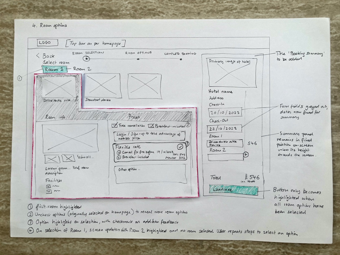
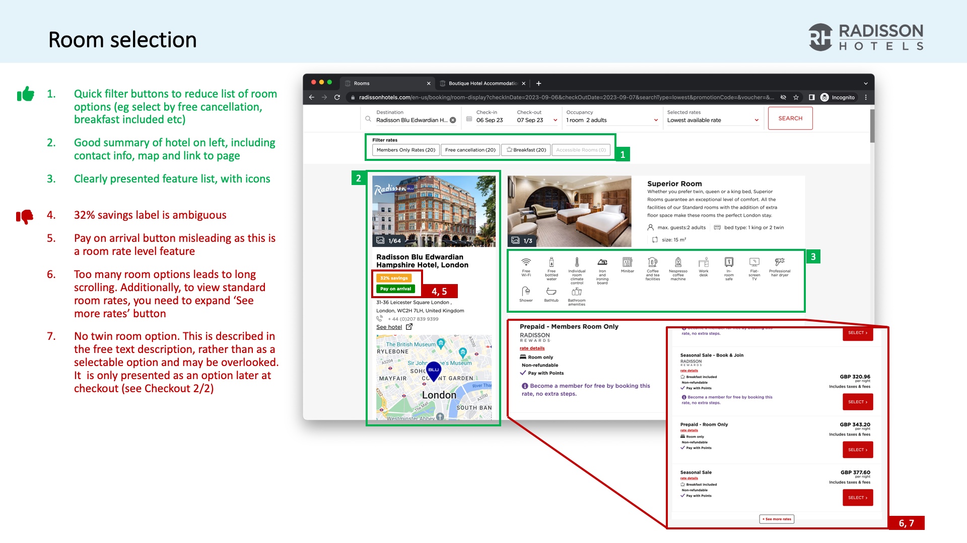
Room options
A lot of information needs to be shown here, in one place. To prevent the need to navigate back and forth, all rooms are shown on the same screen using a tabbed UI.
Filters are shown above the listing of options to help reduce proliferation. The filters are pre-selected according to any filters previously selected during the hotel search. For example, if the user had added free cancellation as a filter from the start of the hotel search, this is pre-selected on this screen, limiting by default the number of options shown.
See all the sketches
The complete set of sketches, including all my comments and reflections, are available in the PDF below.
Design
For this final phase in the lifecycle, I took the concept above and rendered it into a state that can be taken forward into UI design, development or further testing. This involved creating an Interactive prototype, Validation testing and Developer annotations.
Interactive prototype
I created a high-fidelity prototype using Figma. With my experience in web development I have a good awareness of the technical constraints and possibilities of the medium.
Knowledge of HTML5/CSS features such as flexbox and overflow, mobile breakpoints, Javascript-driven UIs etc allowed me to create an accurate layout; one which I could easily communicate to a UI designer or developer.
Key screens
View the gallery below of selected screenshots from the prototype. Beneath each is a description which highlights of some of my design thinking.
-
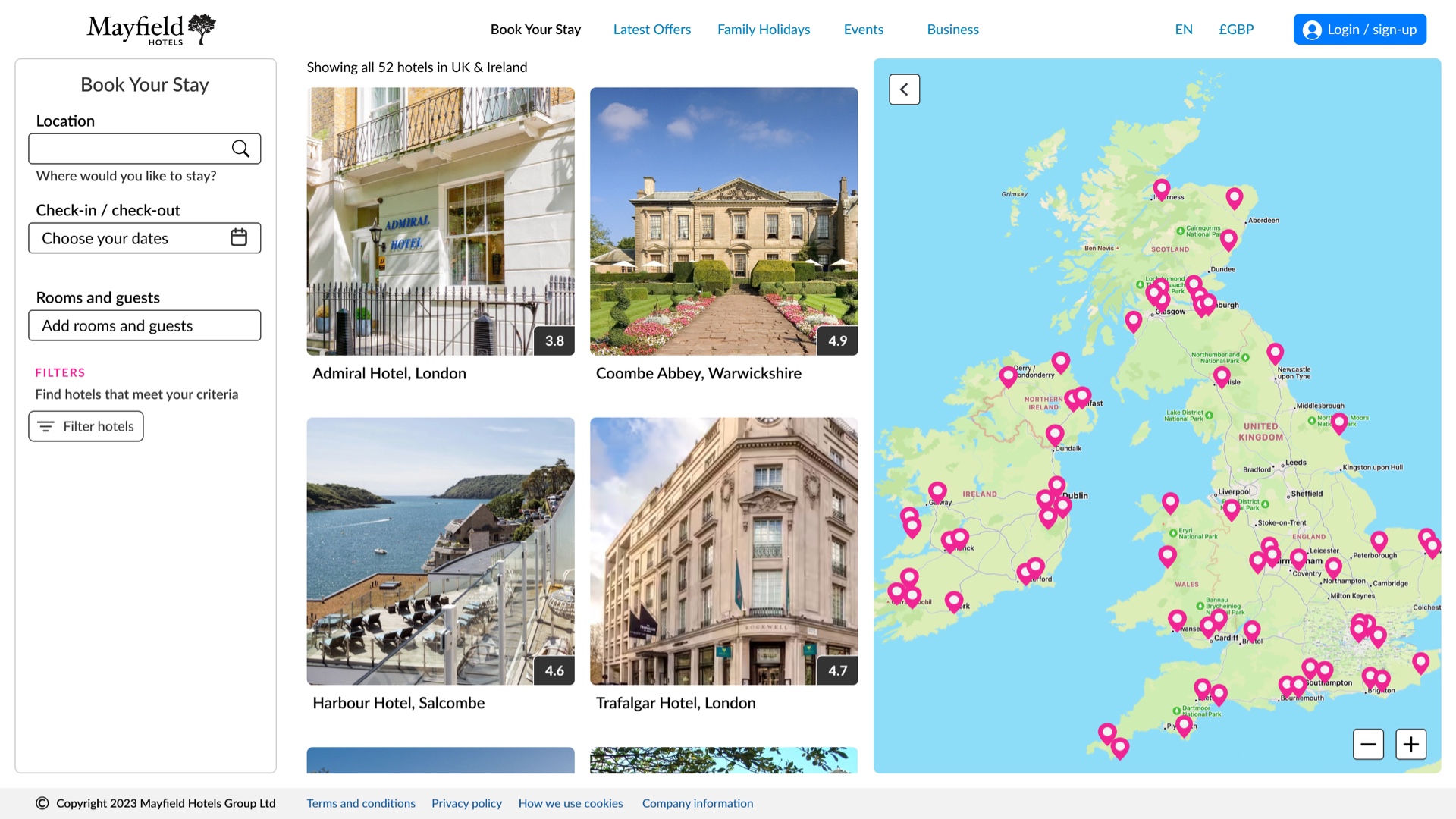
Homepage
I created an imaginary brand Mayfield Hotels to mimic working with a live project.
An important dynamic to the interactivity is the live updating of the results as the user completes the search form and adds filters. There is nuance to how this would be implemented to reduce network burden, but the idea is for a more fluid search experience, with the map results updating to show only results that match the user's criteria.
-
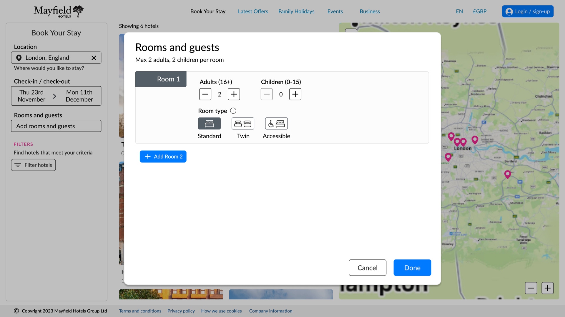
Rooms & guests
Ability to select basic room type is made available at an early stage - this will reflect in the search results and help reduce lengthy room options later in the process.
-
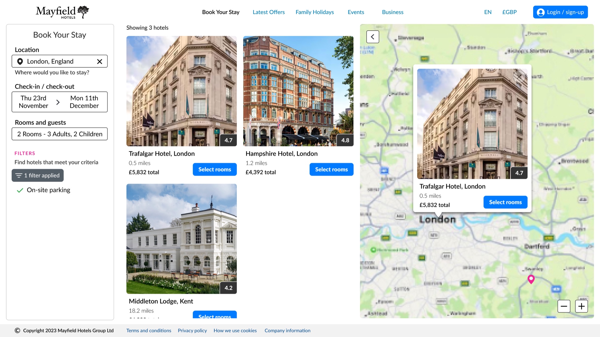
Hotel search
This screen shows the user's completed search criteria and filters, all in one location, as a single source of truth.
To reduce information overload, each result shows only the price that the guest would pay.
-
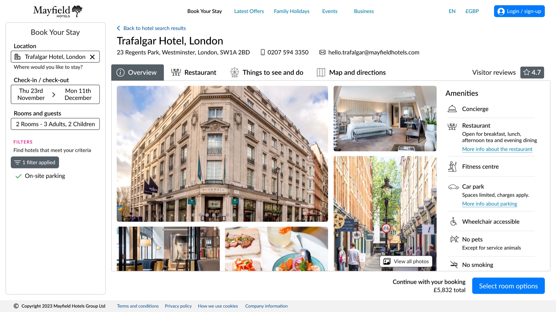
Hotel overview
The search panel carries over to the main hotel overview screen. This continues to re-inforces consistency with the aim to reduce the need for the user to re-learn the layout.
-
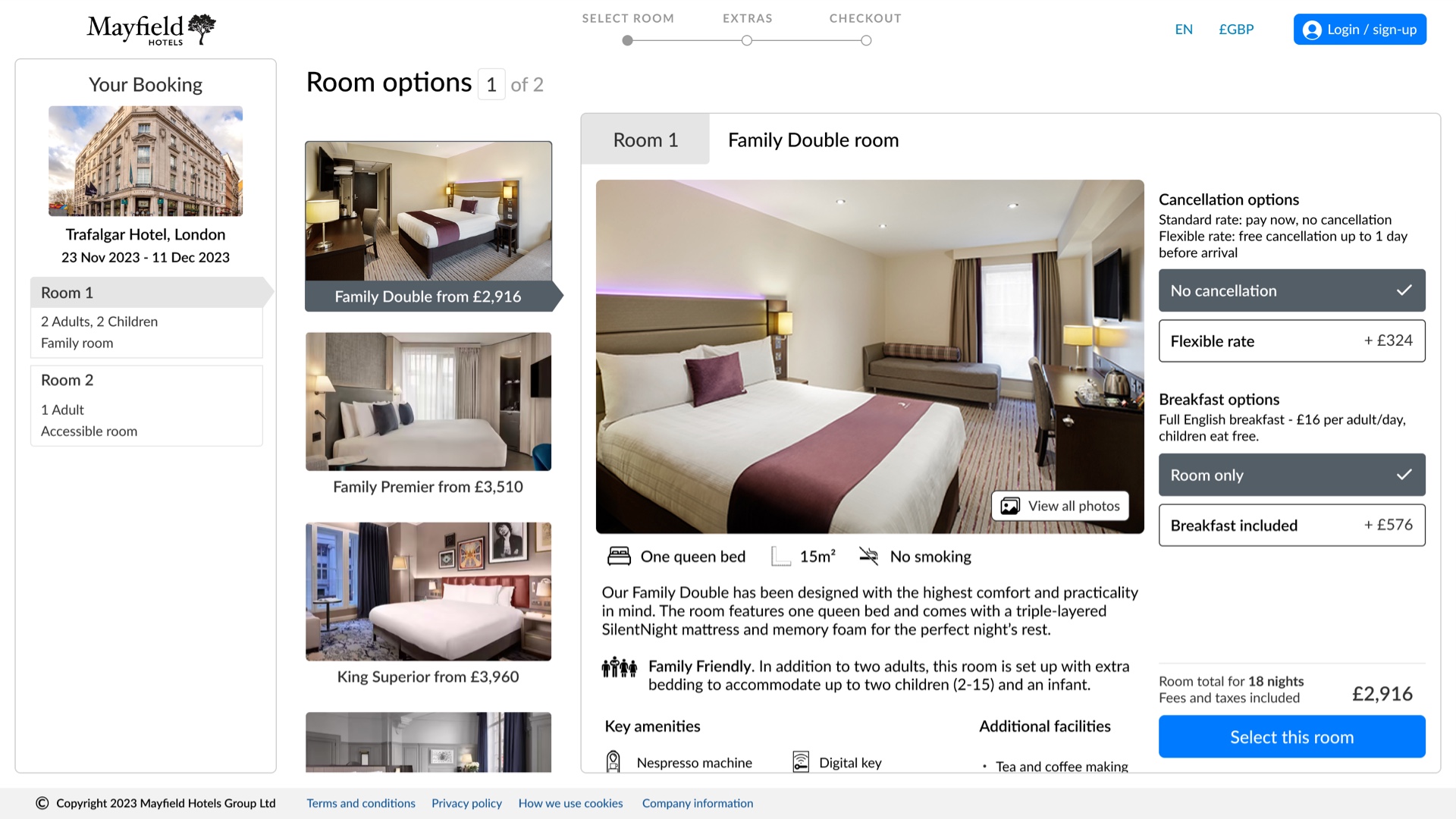
Room options
Addressing issues from user testing, my solution attempts to rationalise room options with each room represented as a tab. Room information can be viewed without navigating back and forth between screens.
In an evolution from the sketches, additional options such as free cancellation and breakfast are represented as radio buttons against each room, so the user can 'build' their package, rather than being presented with a myriad of price options.
Booking panel is located on the left. Whilst this breaks convention with some sites, it mirrors the location of the search panel re-inforcing the single source of truth, something which carries through to all remaining screens. The call to action also remains in the bottom-right of the screen, for consistency.
-
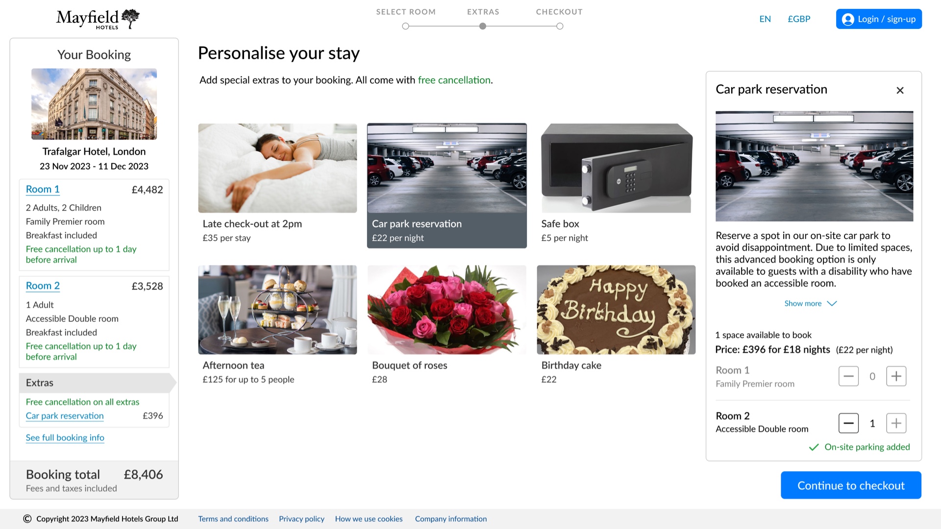
Room extras
Room extras is a marketing upsell. For some users this can be an annnoyance that can potentially distract them from completing the booking. Therefore, no action is necssary on this screen. Whilst the screenshot shows addition of a Car park reservation, the user could simply bypass the screen via 'Continue to checkout'. As with previous calls to action, this is in the same location on the screen.
-
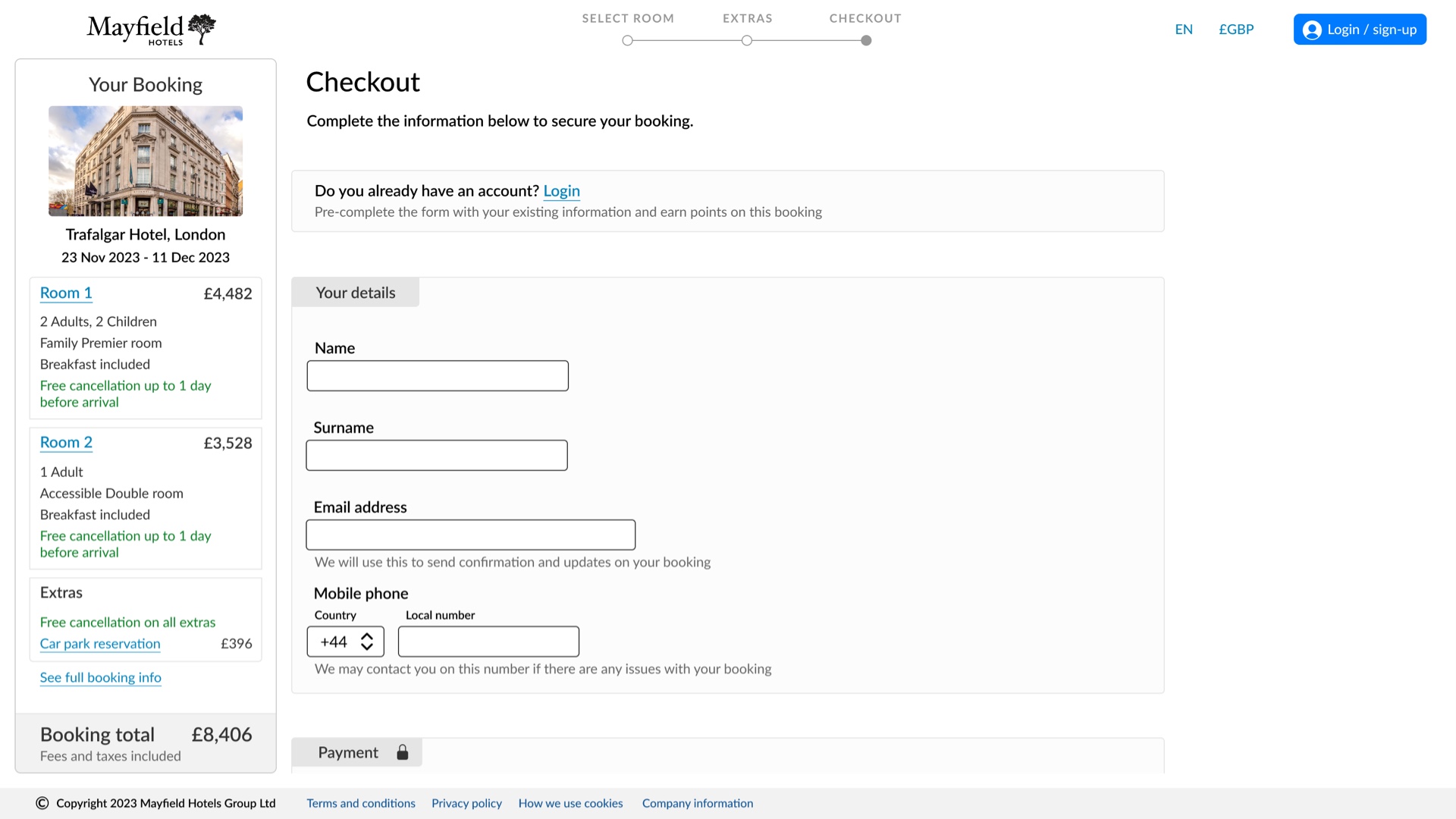
Checkout
This previews how the final booking panel would look. The checkout form only requires the minimum information to complete the reservation, and where required explanation is given as to how that data would be used.
-
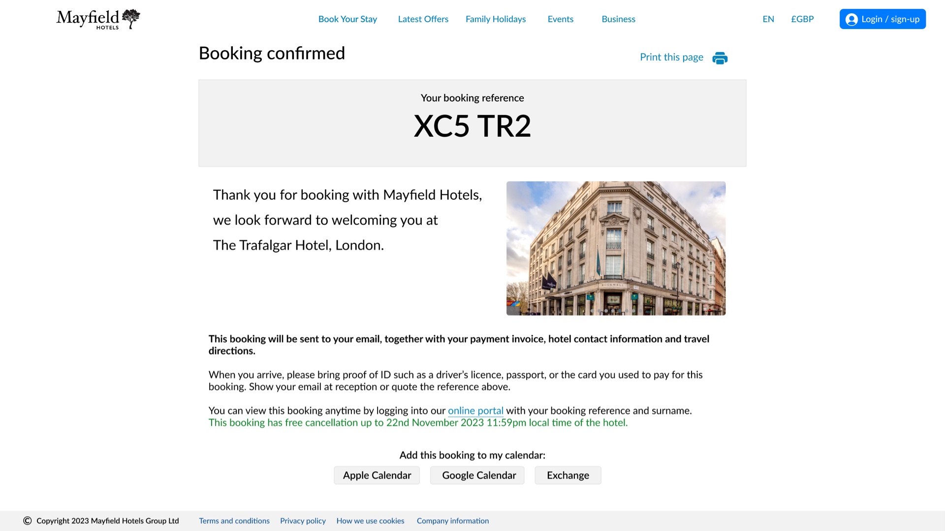
Booking confirmation
This is a simple summary screen. All unnecessary UI is stripped away. The booking reference is stated clearly along with a brief message of gratitude, information about what will happen next, and utilities for saving the booking.
Try the prototype yourself
The prototype is available on Figma. Note the following:
- This is a prototype for desktop, so it can only realistically be viewed on a large screen device
- Once loaded, tap 'z' on your keyboard to fit to screen; its fixed dimensions may not fit all monitors
- The user test scenario can be found in the side drawer to the left of the prototype
I submitted the prototype with additional supporting notes which gives information on some assumptions and technical considerations. You can access this below.
Validation testing
In order to understand how well the solution addressed the usability issues identified during analysis, I performed user testing with the prototype.
I adapted the usability test script used during research, and recruited a volunteer. To help mitigate possible user bias, or an unconscious desire to compliment the design, I framed the prototype as one a few designs being tested in order to find which is the most effective.
Whilst I don't have a recording of the test, I did perform note taking. This was an invaluable exercise, and although I only conducted this with one participant (I recognise that wider testing would be more meaningful), it offered initial validation for certain design decisions where the user was able to flow through without hinderance, but uncovered problems in others.
Problems and remedies
I give examples below of some of the problems found, and their proposed remedied:
- The participant didn't realise that she needed to click into the Location field in order to type a location - she clicked straight on the search icon, resulting in an empty search being peformed
- Set focus to the Location field on page load, so a cursor blinks in the field as a prompt to type (add as comment to annotations)
- The participant was unsure what 'On-site parking' means. As English is her second language, simpler language could have been used.
- 'On-site parking' renamed to 'Car park'.
- On the Hotel overview screen, she queried the call to action label 'Select rooms' if she had already done this in the 'Rooms and guests' modal during search.
- 'Select rooms' renamed to 'Select room options' to help distinguish it.
- On the Room options screen, the radio button for a room rate without cancellation was labelled 'Standard rate'. However, as this was pre-selected under the section heading 'Cancellation', she assumed free cancellation was selected.
- Section heading renamed to 'Cancellation options', 'Standard rate' option renamed to 'No cancellation'.
- On the Room options screen, when the participant advanced to select the second of two rooms, she didn't realise anything had changed. The only indication was a counter which had gone unnoticed in the page title.
- Various fixes, including renaming page from 'Select room' to 'Room options' and prefixing 'Room [number]' to the detail panel.
The changes were implemented into an iteration of the prototype, which is the version shown here, and where relevant the developer annotations below.
Developer annotations
I completed the design phase with producing developer annotations for the prototype.
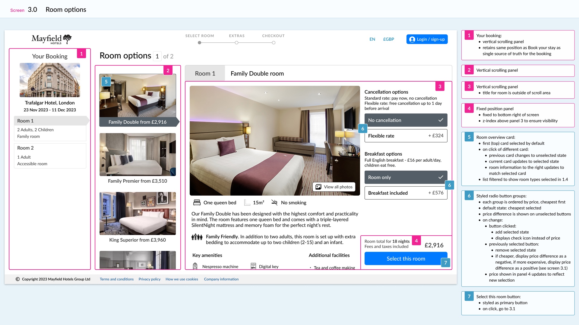
Sample annotation of the Room options screen
The documentation predominantly describes how interactive components function. As my solution is also aware of how it can be implemented technically, there are also some annotations around layout and overflow.
View the annotions
The annotations are available for viewing in Figma.
Note the following:
- Once loaded, you may need to Zoom to 100%, as the screens are stacked vertically
- The first screen at the top contains a Key to the colour coding and labelling
- The style and layout used for this project is quite visual; this was for presentation purposes but I recognise that when using a dynamic tool like Figma on a live project it might be more practical to use the commenting feature for better collaboration
A supporting document is also available, which outlines some more information, including assumptions and scoping.
Retrospective
I take a moment here to look back over my solution and make some observations.
Addressing the research
One of the main objectives for this project was to create a solution that addresses usability problems identified during research. An underlying principle of UX Design is that it is virtually synonymous with user testing.
In this case study I hope to have identified a few of the findings from the research and shown how these were addressed in my solution. For example, the importance of searching visually for a hotel on a map, resolving problems with long scrolling or the proliferation of room options.
Where I could have given more attention
There were some aspects of the experience important to users that I didn't address as much as they may have deserved. For example, the importance of photos or independent reviews. For both of these, I had simply run out of time to think through the UX in a way that I think would have done them justice.
Rating and reviews are particularly important to users, but there is so much potential and detail here that I think that they warrant a UX exercise in their own right. Some hotels will combine reviews with room photos, so these are really nuanced areas that I feel deserve a level of attention that I could not give on this project within the time available.
Some ideas of my own
Conversely, as I looked at the booking process, I could see opportunities for streamlining it, or creating a more fluid experience. Here, I applied some design thinking of my own, not based specifically on any evidence or issues raised during user testing, but to use design principles or patterns I have seen elsewhere, or simply exercise my own desire to try and do something better.
I highlight four key characteristics of the design:
- A hotel search that updates its results live, as criteria is being added
- Locating the search panel vertically on the left; convention typically places this horizontally above the page
- Locating the booking summary panel also on the left; convention typically places this in the right-hand column during the booking process
- Use of scrollable panels and overflow to manage long scrolling content
I have given justification for these implementations in the case study, but they do break with convention to greater or lesser extents; they may not match users' mental models and they may not be as accessible to users of lower IT literacity. Furthermore, they are very hard to test on a small pool of volunteers, and live updating of search results is impossible to test on a prototype.
If these features were proposed for a live project, I would exercise caution. Nonetheless, I find them exciting additions to this solution; they could make all the difference for a superior UX, and I would be curious to know how they would be received in wider testing.
Case studies
Through my career I have worked across the full development lifecycle, from UX and UI design, to development and project management. UX is the heart of everything I do. This is a selection of recent work.